
08 Apr
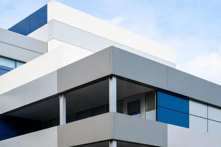
In façade projects, color is not only a design decision. It directly affects how a building is perceived at scale, especially when panels are installed across large continuous surfaces.
In projects exceeding 10,000 square feet, even small color variations can become visually amplified. What appears acceptable at the sample stage can lead to noticeable inconsistencies once panels are installed under natural light and viewed from distance.
This is why architects and contractors increasingly treat ACP custom color as an engineering-controlled process rather than a simple aesthetic selection. At ALUMAX Composite Material Co., Ltd., the Aluwell® system approaches color as a combination of coating control, sample validation, and production consistency.
The final appearance of an ACP panel is determined by multiple interacting factors. Understanding these variables is critical for achieving reliable aluminum composite panel color matching.

The coating defines both initial color and durability.
PVDF coatings provide high resistance to UV exposure and environmental pollutants
Polyester systems are suitable for interior or short-term applications
Anodized finishes create metallic tones through controlled oxidation
Different coating systems will age differently, which directly affects long-term façade color consistency.

Gloss influences how light interacts with the panel surface.
High-gloss surfaces intensify color and reflect surroundings
Matte finishes reduce glare and provide more uniform visual perception
On a completed façade, panels with identical base colors but different gloss levels will appear visibly inconsistent.
Surface structure affects how color is perceived at different viewing angles.
Brushed and metallic finishes create directional light reflection
Wood and stone textures introduce visual variation across panels
Mirror finishes amplify environmental reflections
This is why ACP panel color consistency must be evaluated together with finish selection, not independently.
Color is not only a material issue. It is also affected by installation.
Panel orientation changes light reflection
Joint alignment affects visual continuity
Installation sequence can expose batch variation
Ignoring these factors often leads to color mismatch complaints after project completion.

Color selection should be based on functional and architectural intent, not only preference.
Red, orange, and yellow tones increase visual impact and are commonly used in retail, transportation hubs, and public-facing buildings where attention is critical.
Blue, green, and neutral cool tones create a controlled visual environment. They are widely used in healthcare, education, and office buildings where comfort and clarity are priorities.
Gray, white, and beige tones provide visual stability across large surfaces. They are often used as primary façade colors to reduce perceived scale and maintain architectural clarity.
Accent colors highlight entrances, circulation paths, or brand elements. In large façade systems, they help guide visual attention and improve building readability.
Projects that combine multiple colors require strict coordination to maintain consistency across different panel batches and elevations.

Color performance cannot be separated from surface finish. In many cases, finish selection has a greater visual impact than the base color itself.
Gloss finishes are suitable for projects requiring high visual impact, but they are more sensitive to installation alignment and environmental reflection.
Matte finishes provide a more stable and uniform appearance, especially in large façade applications where consistency is critical.
Metallic finishes introduce dynamic light reflection, which enhances depth but also increases sensitivity to viewing angle.
These systems require tighter control during fabrication and installation to avoid visible variation.
Wood grain and stone finishes allow designers to achieve natural aesthetics while maintaining the durability of aluminum systems.
However, pattern alignment and panel orientation must be controlled during installation to avoid discontinuity across the façade.
Anti-graffiti, reflective, and antibacterial coatings extend panel functionality beyond appearance.
In high-traffic environments such as hospitals or transportation facilities, these coatings reduce maintenance costs while maintaining long-term visual performance.

Custom color is not a one-step process. It is a coordinated workflow designed to ensure that approved samples can be replicated consistently at scale.
Projects typically start with a reference.
Brand color systems such as Pantone or RAL
Physical material samples
Architectural renderings or concept images
This defines the target, but not the final production result.
Suppliers produce sample panels based on coating type, gloss level, and surface finish.
Samples must be evaluated under multiple lighting conditions, including daylight and artificial light, to verify visual consistency.
Once approved, key parameters are defined.
One of the most important is Delta E, which measures the difference between two colors in a three-dimensional color space. Lower values indicate higher consistency and are critical for façade-scale applications.
Other parameters include gloss tolerance, coating thickness, and curing conditions.
During mass production, maintaining ACP panel color consistency becomes the primary challenge.
Variation can occur due to:
Coating process fluctuations
Raw material differences
Equipment calibration
Without strict control, panels from different batches may appear visibly different once installed.
Aluwell® addresses this by integrating coating control, process calibration, and production monitoring to reduce variation risks in large façade projects.

Color consistency must be managed beyond manufacturing.
Panels should be grouped by batch during installation
Orientation should be consistent across elevations
Fabrication tolerances must align with coating performance
This coordination ensures that the approved sample is accurately translated into the final building.
Not every project requires custom color. However, certain scenarios make it necessary.
You should consider ACP custom color when:
The project requires strict brand color alignment
The façade spans large continuous surfaces where variation is visible
Multiple materials must visually match across the building envelope
The design relies on color contrast or gradient effects
In these cases, relying on standard colors may lead to compromises in design intent or visual consistency.
Standard ACP colors are pre-produced and suitable for general applications with faster delivery and lower cost. Custom colors are developed for specific projects, allowing closer alignment with design intent. They require sample validation, coating adjustment, and stricter production control to ensure consistent results across façade-scale installations.
ACP panels can closely match brand colors through controlled coating systems and sample approval processes. However, exact visual matching may vary slightly depending on gloss level, surface texture, and lighting conditions. For critical applications, physical sample validation is essential to confirm the final appearance before mass production.
Color differences often result from lighting conditions, viewing angles, panel orientation, and gloss variations. Even with identical coatings, these factors can change visual perception. This is why color should be evaluated at the façade scale, not only on small samples, especially in large or highly reflective installations.
Delta E measures the difference between two colors in a three-dimensional color space. It is commonly used to control color variation during production. Lower Delta E values indicate closer matches and better consistency, which is especially important for large façade projects where small differences can become visually noticeable.
Custom ACP colors typically cost more than standard options due to sample development, testing, and production adjustments. However, they help reduce the risk of color mismatch, rework, and visual inconsistency. For projects with strict branding or façade requirements, custom colors often provide better long-term value.
Custom color development usually includes sample production, testing, and approval, which can take several weeks depending on complexity. Additional time may be required for coating adjustments or multiple iterations. Early planning is recommended to avoid delays in fabrication and installation schedules.
High-performance coatings such as PVDF are designed to resist UV exposure, weathering, and environmental pollutants. When properly specified, they can maintain color stability for many years in exterior applications. Long-term performance depends on coating quality, environmental conditions, and proper installation practices.
Yes. Multi-color ACP façade systems are widely used to create visual rhythm and highlight architectural features. However, they require careful coordination of panel batches, installation sequence, and orientation to maintain consistency. Without proper planning, visible variation may occur across different façade areas.
Custom color in façade systems is not only about matching a shade. It is about ensuring that the color performs consistently from concept to installation.
ALUMAX Composite Material Co., Ltd. positions Aluwell® as a system-based solution rather than a product-only supplier.
Support for both standard and custom color development
Integration of coating control, sample validation, and production calibration
Experience in managing color consistency for large façade applications
Coordination across design, fabrication, and installation stages
Extended capabilities including collaborative design, machining, and modular solutions
For projects where color consistency directly impacts architectural quality, early coordination and controlled development are critical.
Aluwell® provides a structured approach that helps reduce uncertainty and ensures that the approved design intent can be delivered reliably at building scale.